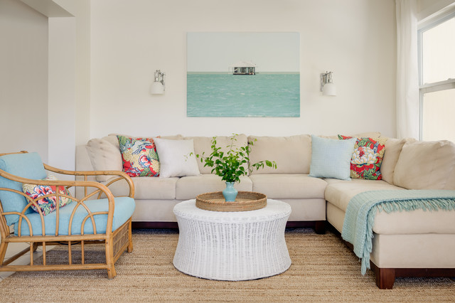
Creating a Mood with Color is Super Easy

The easiest and most effective way to create a mood in your home is by using color – be it through paint, decor or accessories.
Smart but simple decoration
- Choosing colorful elements and combinations wisely means you will not have to spend a fortune to create a striking space. Follow these simple steps when using colors;
- Take time to first plan your color scheme (mistakes can be expensive and rectifying them can be even more time consuming);
- Always arrange colors according to your personal preferences and if you’re in doubt get advice that you feel comfortable with;
- Use repetition, for instance, different shaped objects or vases grouped together in the same color tones will immediately create interest;
- Flowers are the simplest way to add color to any room and an arrangement of striking orange Gerberas instantly brightens the setting.
What to blend
Vivid colors are rich and strong on their own. When you use them together they balance each other and, as a result, don’t appear as overpowering as one bright color would on its own. For example, green on the wall can be countered by the orange chair – while the white skirting and painted canvas on the wall will create a resting point for the eye.
Where to go bold
Vibrant colors work best in a room that has the scope to take in a lot of colors; always take the changing daylight into account when going bold, as it could alter the effect quite radically.
Try to mix hard and soft shapes and surfaces when using strong colors, to prevent it from dominating a room. Also limit the use of different patterns, textures, and details as this will confuse and distract; rather opt for plain surfaces and textures (such as this ‘grass’ carpet) to retain the overall feel. Green may be used as the base color; it originates on the ‘cooler’ side of the color wheel and is ideal to give a room a calm, refreshing feel. Energising orange as an accent color adds warm tones and contrast while white, brought in by the skirting and this canvas on the wall, softens the focus and creates a resting point for the eyes.
Tips:
White is used as a neutral color to soften the vivid, overall effect.
Green is used as the base color.
Orange is used as an accent color to warm the look.
Use an accent color in moderation – too much, and it becomes a feature, too little, and it can become overlooked.
